fieldday
Mini Brand Guide
Welcome to the Field Day Mini Brand Guide! This brief manual introduces Field Day, a modern coffee roaster rooted in Yorkshire. Committed to quality, we meticulously roast our beans daily for ultimate freshness.
At Field Day, we believe in a charming and uncomplicated approach, reflecting the joy of savouring a perfect cup of coffee. Our brand offers a blend of enjoyment and accessibility designed to elevate your everyday moments with a touch of elegance.
Have you got a question? Reach out to us anytime! 🖐
Logotype
Typography
Icons
Colour Palette
Labels
Gradients
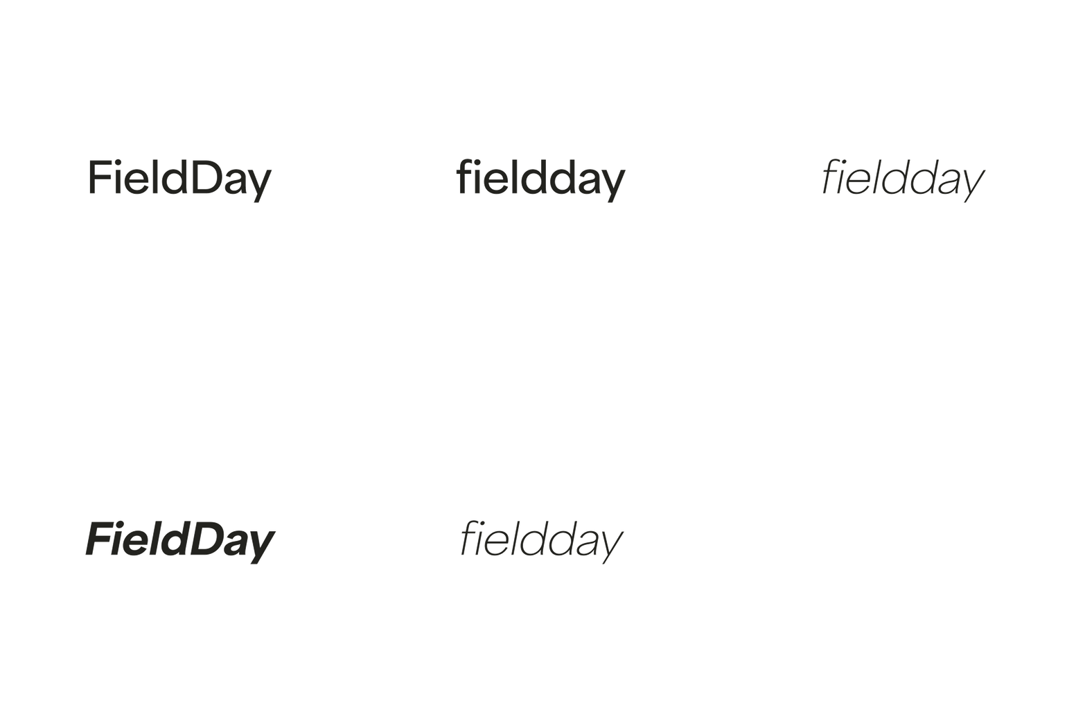
fieldday is designed with adaptability, flexibility, and growth at its core, subtly infused with natural inspirations.
Our brand identity showcases a versatile wordmark and a dynamic colour palette featuring gradients reflecting the natural world's fluidity.
The gradient colours represent the brand’s dynamic nature, symbolising its readiness to evolve and adapt to shifting market trends and consumer preferences.
The elements of fieldday’s identity come together to support a brand poised for expansion and success in the coffee industry.
area
semibold regular
ABCDEFGHIJKLMN
OPQRSTUVWXYZ
abcdefghijklmn
opqrstuvwxyz
1234567890
!@£$%^&*()_+
fieldday's choice of Area from Adobe Fonts reflects a commitment to modernity and clarity. This clean, sans-serif typeface ensures legibility and visual appeal in all textual content.
Area in semibold and regular weights anchors titles and body text, providing a balanced visual experience. For slogans, the italic variant of area adds sophistication and emphasis, aligning perfectly with the brand's messaging style.
area
glyphs
Area glyphs for the letters 'f' and 'd', set within circles, transcend traditional typography to become versatile icons for fieldday.
This integration of typography and iconography showcases a clever and innovative approach, ensuring brand consistency across varied platforms. These glyphs-as-icons symbolise fieldday's adaptability and commitment to a distinctive, unified brand identity.
swingking
icons
fieldday embraces the uniqueness of SwingKing Icons from Adobe Fonts, a collection of hand-drawn hand gestures and organic, simple natural icons.
These icons bring the brand an authentic, artisanal touch, adding depth and character where needed. The hand-drawn quality of these icons reflects the brand’s commitment to craftsmanship and personal touch, resonating with the natural, organic ethos at the heart of fieldday.
Versatile and expressive, these icons can be strategically used across various brand materials to infuse a sense of warmth and approachability, ensuring that every interaction with the brand feels personal and engaging.
The ease of integration due to their font-based design offers a user-friendly approach to brand expandability while ensuring consistency across all platforms.
colour palette
fieldday's colour palette is a harmonious blend of natural and urban tones, reflecting the brand's fusion of organic inspiration and contemporary sophistication.
From the invigorating freshness of jade to the understated elegance of greys and the purity of white, each colour is chosen to evoke a sense of balance and vitality.
This palette resonates with fieldday's identity and offers versatility in design, allowing for a wide range of applications that can adapt to different contexts while maintaining the brand's cohesive and distinct visual language.
coffee labels
template
The coffee label design for fieldday is encapsulated in a minimalist template created in Adobe Illustrator, designed for ease of updating and customisation.
This simple yet elegant framework is complemented by sample text for the coffee blend and taste notes, ensuring that essential information is conveyed in a clear, uncluttered manner.
The template's user-friendly design allows for quick modifications, making it a practical tool for consistent branding across all coffee varieties.
coffee + people
coffee + people
coffee + people coffee + people
gradients
template
The gradient backgrounds of coffee labels are centred around a palette of tertiary colours, adding a layer of depth and sophistication unique to the brand.
Designed by combining four colours, and enhanced with a subtle 5% noise applied, this treatment improves print quality and adds a distinctive texture to each label. Using tertiary colours in these gradients creates a visually rich and dynamic effect, ensuring that each coffee label is eye-catching and unique.
The gradients are designed for easy adjustment, enabling a user-friendly approach to updating the brand's visual identity. This adaptability allows fieldday to maintain a contemporary and flexible image, in tune with current trends and specific branding needs.
subscription
solution
One-Time Purchase
Subscribe
In order to work with the features available on Squarespace's platform, fieldday has implemented a two-button option on product pages to offer both "One Time Purchase" and "Subscribe" choices.
This straightforward solution addresses the need for built-in functionality for selecting purchase types on Squarespace, ensuring customers still have the flexibility to choose between a single purchase or a subscription.


